Details from the work.
Interface details from shipped and tested work, at the size they were designed. Each links to the case study it came from.
Commonplace · AI patterns
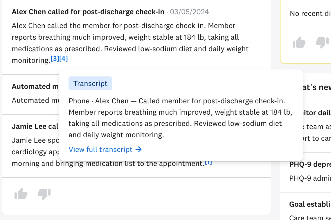
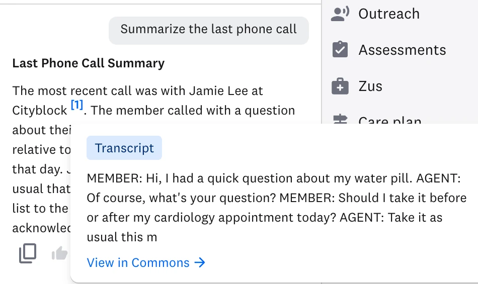
Chat that shows its sources
Suggested prompts scope what the model is asked. Answers carry numbered sources, and a source opens the call note or transcript behind the claim, so a care team member can check it before acting.
Commonplace case study →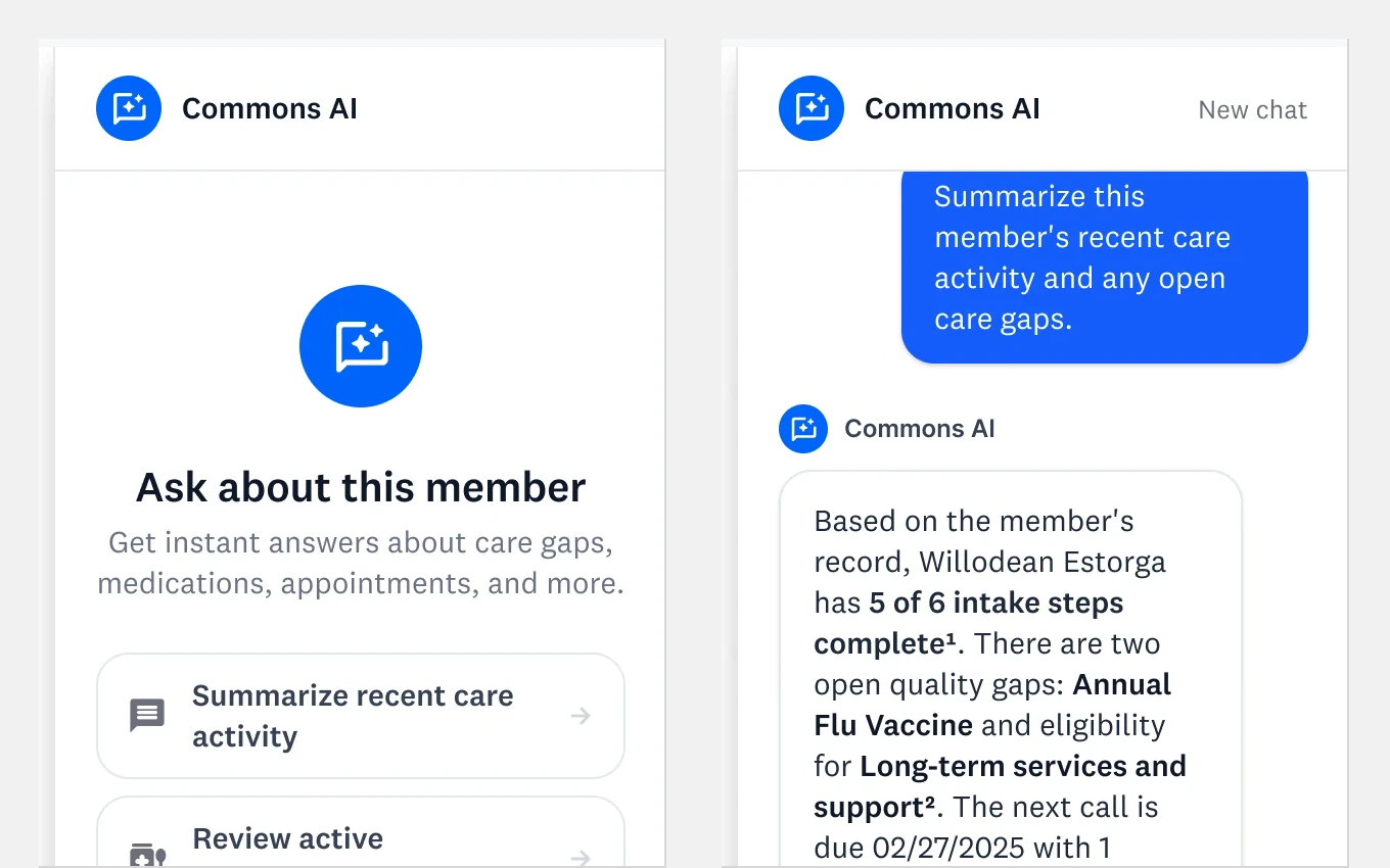
Commonplace · Coding agents
The same button, with and without Code Connect
Without a mapping, an agent reading the Figma frame wrote a raw button, an emoji icon, and nineteen lines of stylesheet. I mapped 59 of 60 components so agents reach for the production component instead. The comparison is simulated to show the mechanism.
Commonplace case study →
Commonplace · Usage guidelines
Rules alongside the variants
I introduced usage guidelines to the component documentation. The Button page pairs its states with do-and-don’t examples: keep labels short, and separate a passive count from the number of items an action affects.
Commonplace case study →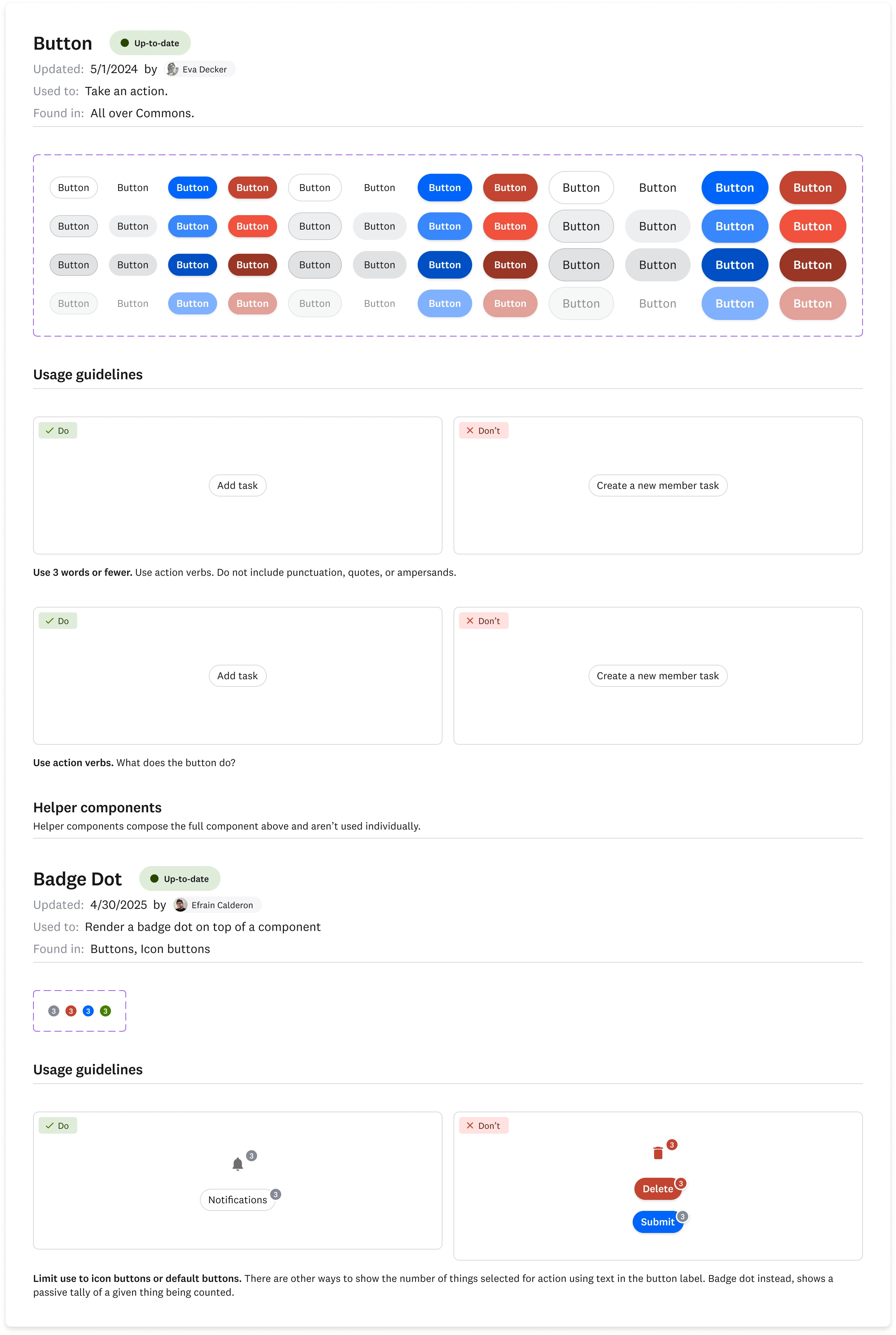
Commons · Navigation
Keep the labels, take back the width
Two collapsed-navigation concepts failed with people who hadn’t memorized the icons. I kept the labels and narrowed the rail: 8.4% more content width in 54 lines of code, after deleting 476 lines of rejected concepts.
Commonplace case study →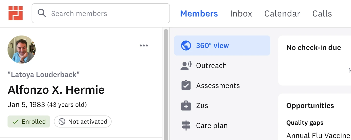
Care Plan · Approval states
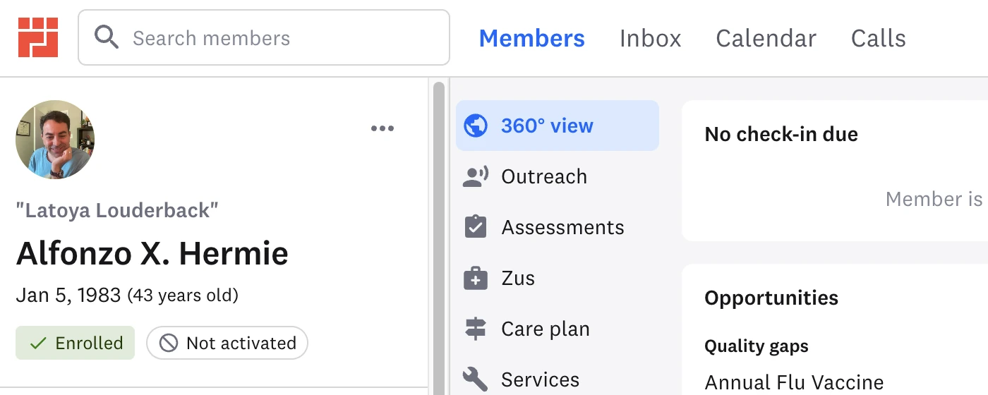
One word of difference
The nurse’s draft, the nurse’s pending plan, and the manager’s pending plan. The last two are identical except for one word: same plan, same state, different permission.
Care Plan case study →


Inbox · Floating note
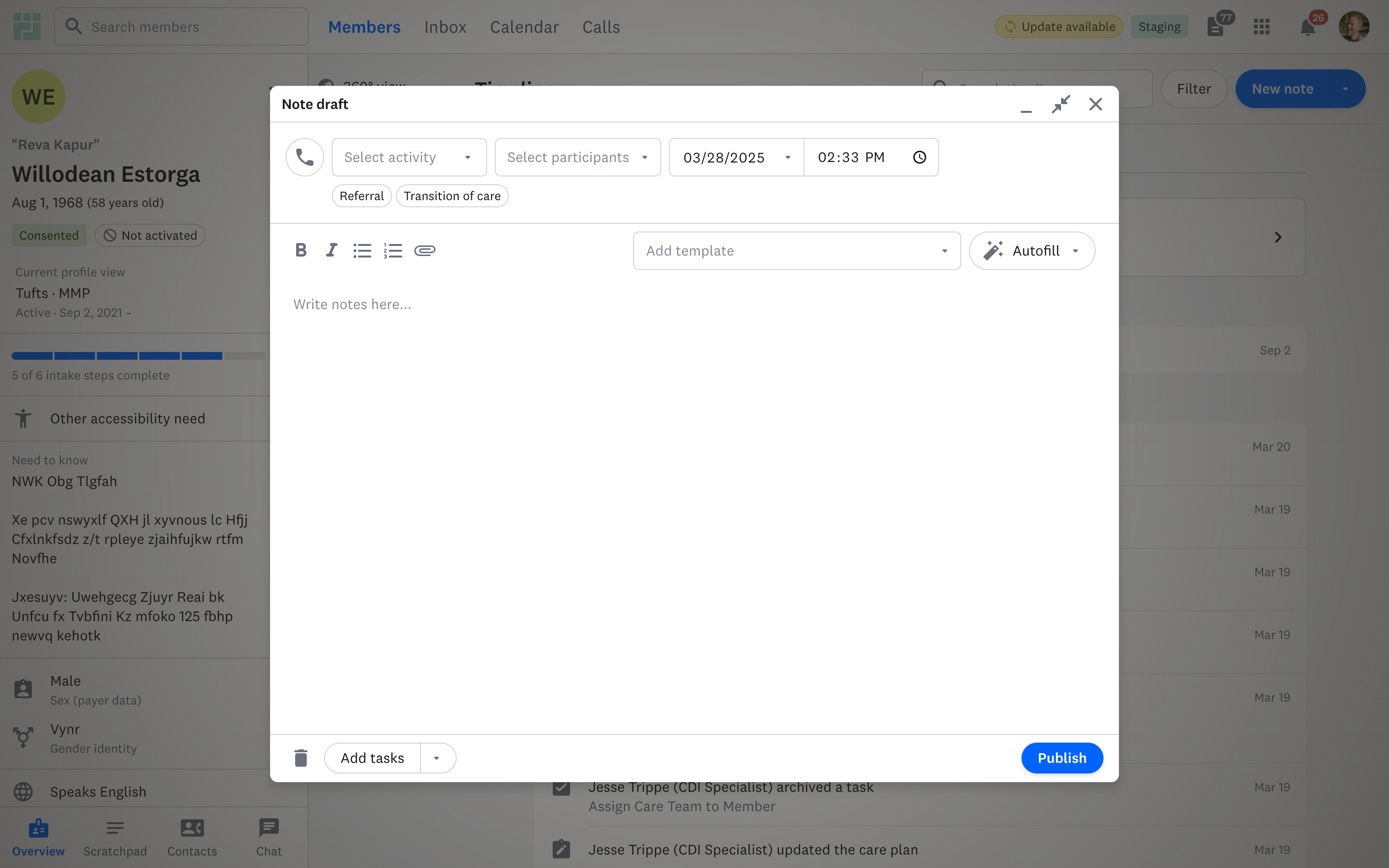
A note that follows you
I designed and built a floating note so care teams can document while researching elsewhere in a member’s profile. Pilot feedback added Esc to minimize and an expanded view for more writing space.
Inbox case study →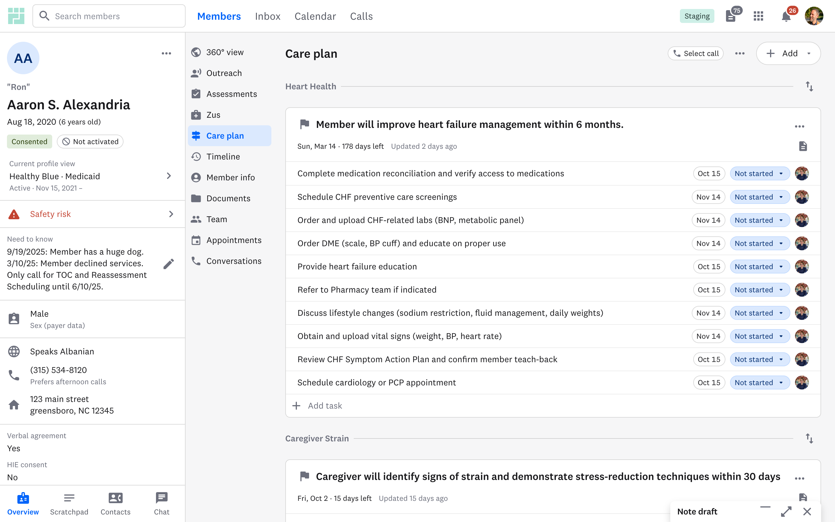
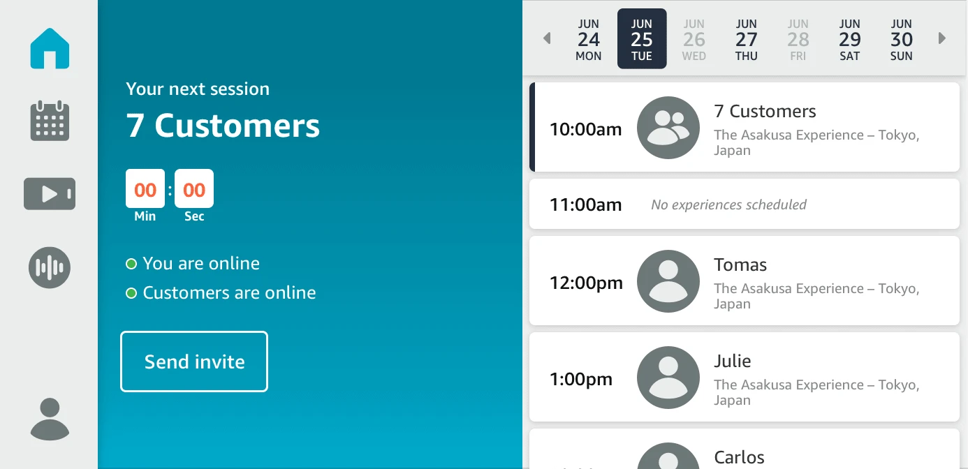
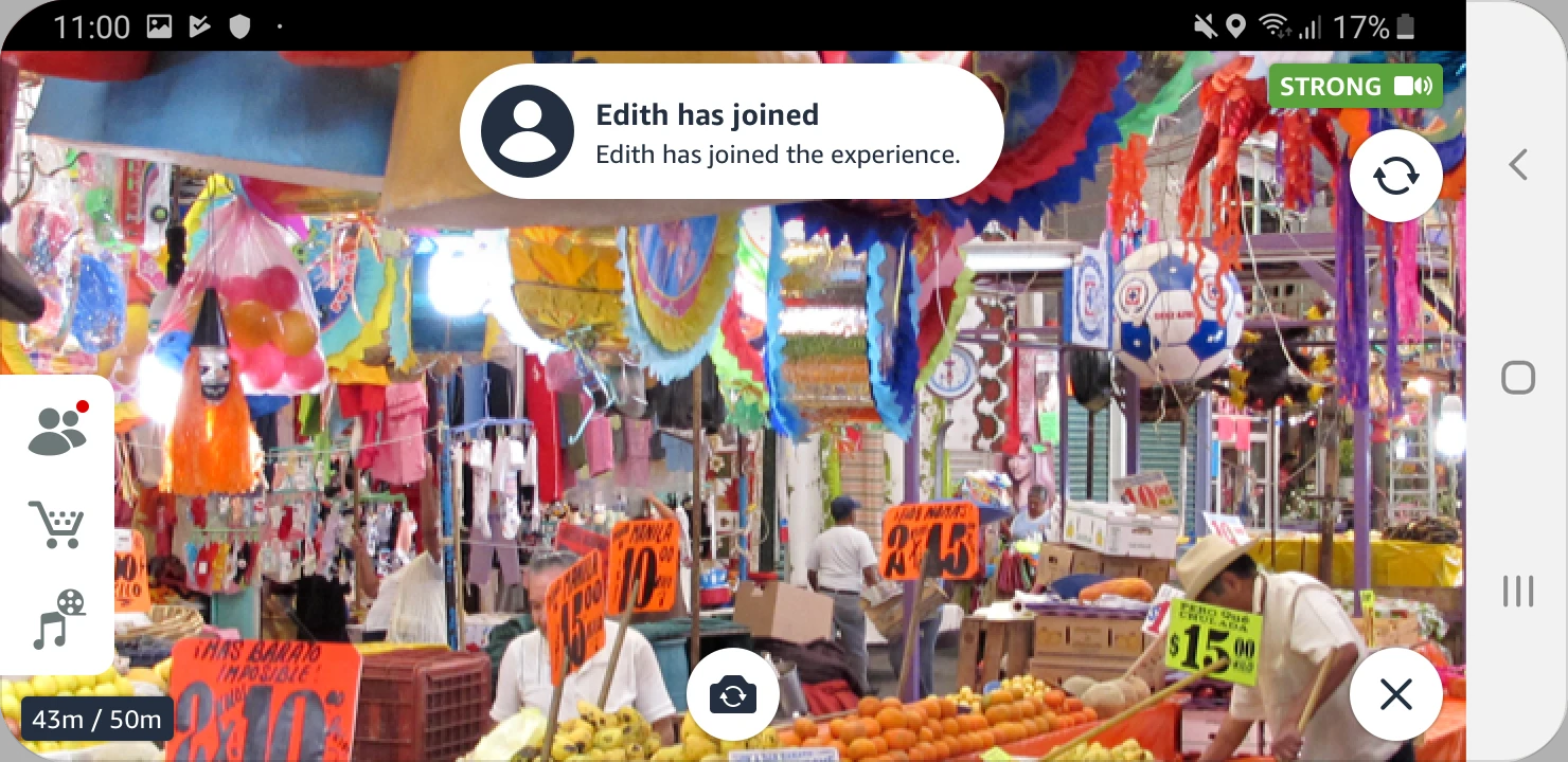
Amazon Explore · Guide controls
Designed at a desk, corrected for daylight
In the beta, guides couldn’t read my icons in bright light at gimbal distance, and the menu sat close enough to the selfie camera that reaching for it could cover the stream. I raised contrast, enlarged controls, and moved the menu off the guide’s reach path.
Explore case study →